If you click on the Block Forms menu entry, you can find an overview of your current block forms. This is the place where you can manage all your block forms.
Once you have enabled the plugin you can find a new menu entry “Block Forms” in the Newsletter menu.
Click on “Add New” to create a new Block form.
Select a template
You can now give your form a name and start with one of the predefined patterns.
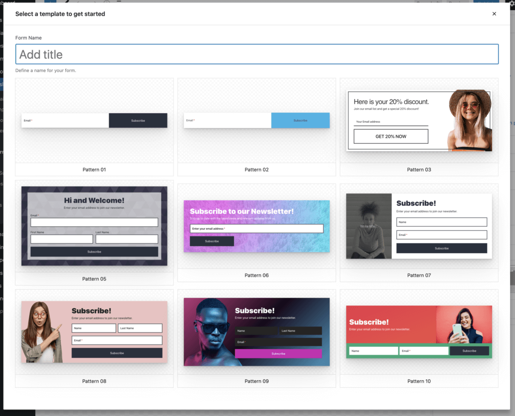
If you close the modal Mailster will start with a basic form only containing the email address field and the submit button.
Adding/Removing Form Fields
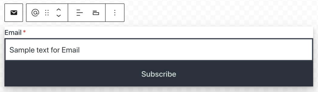
You can add additional fields to your form by adding them like other blocks in the Block editor. Click on the plus sign at the very top to get a list of available blocks.
Not all blocks are supported inside the form.

Customize Form Fields
There are several ways to customize your form. The forms will inherit the styles of your current theme.

Labels
Define a label for the field.
Inline Labels
Enabling this option will display the label inside the input field.
Required Field
This makes this field required. The email address is always required. The validation of the fields happens on the server side.
Show asterisk
Enable an asterisk (*) after the label on the required fields
Use the native Form element
By default, “email” is used as type on the email input field (type="email"). This is recommended for accessibility. If disabled forms are always using type="text".
Some sections may not be available depending on your WordPress version and used Theme.
Width
Define the width of the element. Since the form uses Flex-box for the layout elements will show up in one line if the width is reduced to a certain point.
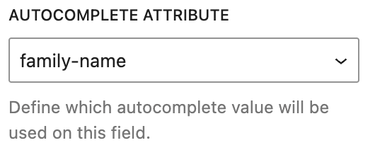
Autocomplete Attribute
Most input fields offer an autocomplete attribute. This will be used by browsers, to populate the field with the data from the user and helps to fill the form faster with fewer errors. If you like to change the default value, you can do this here.
Error Message
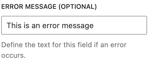
By default, Mailster will show a generic error message if a problem is found on one of the fields. You can adjust this error message here.
Options

Each form has several options which help you customize the look and feel of your form.
To access the current form options, click on “Form” in the inspector.

Form Name
Define the name of your form. This is useful to recognize them at other places on your site.
Enable double op in
All subscribers who sign up will get a confirmation message where they have to confirm their email addresses.
GDPR compliant
This enables a dedicated checkbox block on your form which must be checked to submit the form. This makes sure you get the consent of your subscribers to actually send emails to their email addresses. While this is required by law for all European citizens
Merge Data
Allow users to update their data with this form. Data like tags and lists will get merged together. This is useful if you have multiple forms on your site and people can sign up at various places to different lists.
Redirect after submit
Enter a URL to redirect people to a certain address after they have submitted the form.
Edit Error/Success Messages
Clicking this button reveals the hidden messages block to define the look and content of error and success messages.
Double Opt-in/Single Opt-In
Define the content of the email confirmation message where people can confirm their email address. (Only if double-opt-in is enabled on this form)
You can use placeholder tags like {firstname} in all of the fields (except redirection)

Subject
The subject of the email.
Headline
The extra headline above the content of the email.
Content
The actual content of the email. Must include a {link} tag.
Link text
The text of the link used in the content.
Redirect after confirm
You can redirect users to a specific URL once they click the confirmation link in the email.
Read more about redirections here.
Lists

You can define which lists people get subscribed to if they submit the current form. While you can not use any list here it’s recommended to have at least one list checked.
Users Choice
Decide if users can decide which lists they subscribe to. If checked a new block with selected lists will get added to your form. If unchecked, users will get subscribed to all checked lists.
Form Styles
Apply some basic styling to your forms here. You can define a text color (Color) and a background color. Sometimes a CSS rule with higher specificity will overwrite this setting.

Input Styles
Define the style for your form elements. While you can do this for all form elements globally you can edit the styling of each element as well by clicking on it and choosing the Input Styles options of that particular form element.

Custom CSS
Define additional CSS for your form here. Use the General tab to apply CSS for every device, Tablet only for tablet-sized screens, and Mobile for mobile screen resolutions.
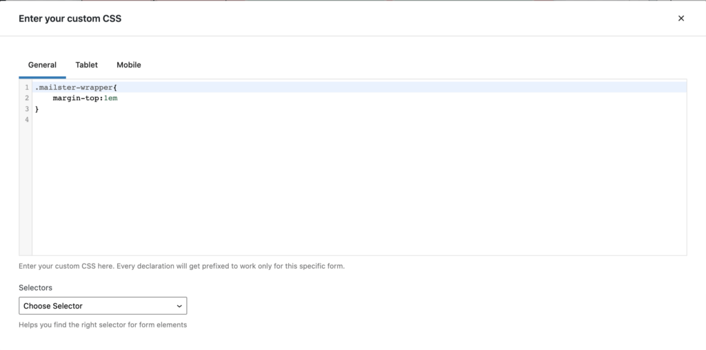
The Selectors drop-down will help you find the right selector for the most common elements of Mailster Block Forms.
All selectors will be prefixed to only get applied to your current form to not affect other elements on your website.
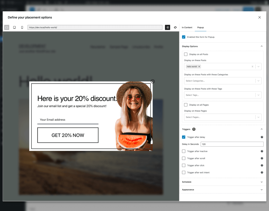
Placement
The placement option lets you define where and when your form should be displayed.
This section is about dynamic placement. If you like to use the form on a single page with a block or shortcode check the Static Placement section.
Currently, you can display the form inside your content (blog post, page content, product description, etc.)
There’s an explicit way and an implicit way to display a form. The most commonly used is the implicit way, where you define conditions, and Mailster will determine, based on content type, time, and user properties, whether to display the form or not.
In Content
This option helps you to display the form in your content. This is useful if you like to collect leads from your blog posts or on your product pages.
Popup
Display your form as a pop-up. This option gives a lot of attention and users are more likely to subscribe to your newsletter.
Display Options
Define on which pages you like to display the form.

Triggers
If you use a pop-up form, you have to decide how the pop-up gets triggered.

Trigger after delay
Show the form after a certain time on a single page. The timer will be reset if the page gets reloaded
Trigger after scroll
Show the form after a certain scroll position in percent is reached. 0% is the very top of the page and 100% is the very bottom of the page
Trigger after click
Show the form after the user clicks an element with a defined selector. Read more about selectors here
Trigger exit intent
Show the form after the user moves the mouse outside of the page. This often indicates leaving the page.
Schedule
Define time frames when the form gets displayed. This is useful if you have a promo running for a certain amount of time and don’t like to have signups outside this period.

Define the start and the end date when the form should be displayed. If you don’t set any schedule, the form will be displayed if the conditions in Display Options meet
Appearance
Define further options for how your form appears on your page. These settings are specific to the current display form.

Static Placement
If you like to use your form only once on a post or page you can also use the “Mailster Form Block” or a shortcode.
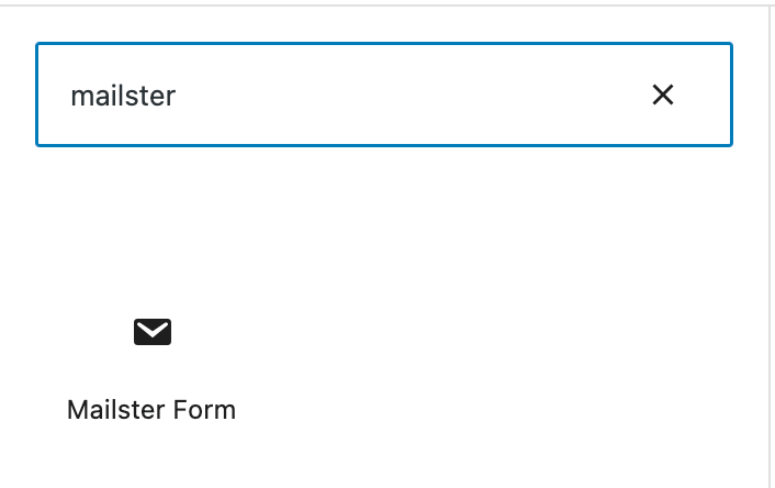
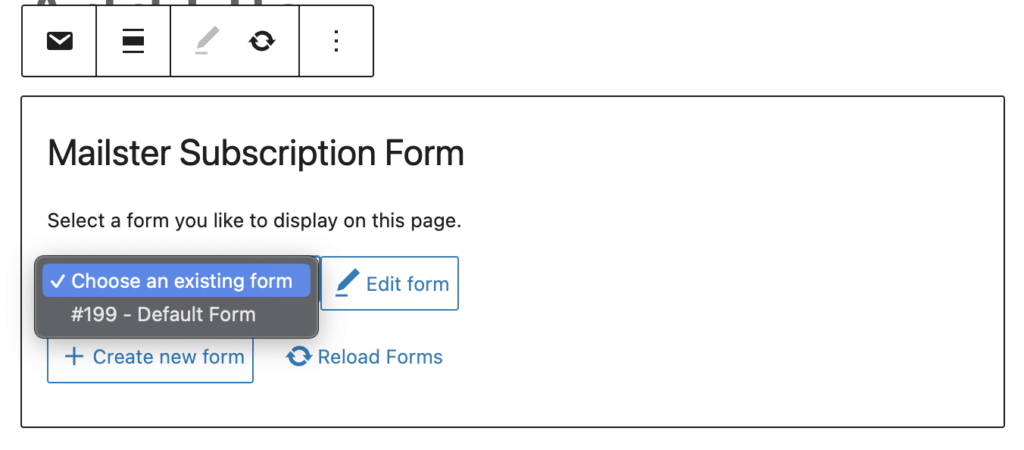
Mailster Form Block
The simplest way to add a block form to your page is to search for the Mailster Form Block.
Find the “Mailster Block” in the Inspector and bring it to your site by either clicking on it or dragging it into the right spot.
Once it’s there, you have to select the form you like to use from the dropdown.
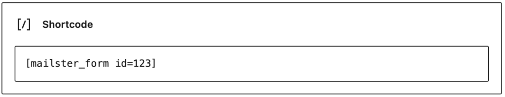
Shortcode
If you can’t use blocks, you can fall back to a shortcode. Just use [mailster_form id=X] (where X is the ID of your block form).